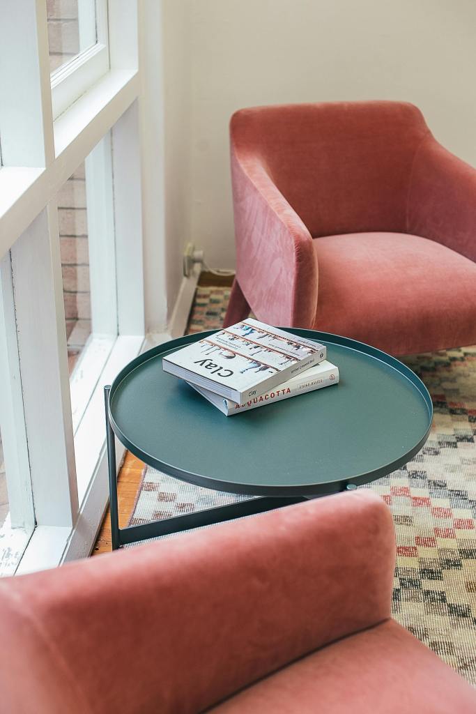
If you’re interested in fashion, you may have come across a term “Seasonal Colour Analysis”. In short, it’s a system that uses eye colour, hair colour and skin undertone to formulate a person’s best individual colour palette. For example, as a typical “Winter” my go-to colours are clear and cool hues – greens, blues, pinks. Reds and yellows don’t suit me at all. I see an analogy in interiors. If a room is bright and full of light, you won’t add more brightness and lightness to it, you will balance it with cooler and darker colours.
Here I’ve listed some suggestions, depending on the orientation of the windows:
East-facing windows capture the gentle, warm light of the morning sun, fading to a cooler light in the afternoon. This duality allows for a versatile colour palette that can shift throughout the day. Soft, muted tones like pale pinks, lavender, and light taupes can enhance the morning light without overwhelming the space as the light changes.
South-facing windows receive ample sunlight throughout the day, which can make rooms feel overly bright and warm. Using cooler colours can balance this effect, providing a sense of calm and relaxation. Cool tones like soft blues, greens, and cool grays work well. These colours help to counteract the intensity of direct sunlight, creating a balanced environment. South-facing room can endure the use of darker colours as well.
West-facing windows receive intense, warm light in the afternoon and evening. This strong light can create dramatic shadows and highlights, necessitating colours that can soften the overall effect.
Earthy and neutral shades such as warm browns, beige, and creamy whites can mellow the intensity of the late-day sun.
North-facing windows receive the least direct sunlight, resulting in a cooler, more diffused light. To counteract this, choose warm and inviting colours that add cosiness and vibrancy. Opt for warm hues like rich yellows, terracotta, warm whites, and golden tones. These colours will make the space feel more inviting and less stark. Avoid darker colours as they would enhance the lack of light.
The orientation of your windows significantly influences how colours appear in your interior spaces. The strategic use of colour can transform your home into a stylish, comfortable haven.Take a look around you. Is this room very light? Is it dark? How does it make me feel? Would I like to see something else here? What colours could I add or remove to improve the overall feeling of the space? Do I know how to achieve this particular look?

Komentiraj